In our continuous quest for faster software with higher efficiency, more stability and lower costs, can we automatically prevent CPU waste from getting into production?
We have Perfana set up for our Afterburner service and run continuous performance tests. Afterburner is a Java Spring Boot based (micro) service with artificial performance issues. There is a Gatling load script that simulates peak load traffic for our Afterburner service. It runs daily from a Jenkins pipeline, but we can also start it manually. The name of this particular install of Afterburner is “Optimus Prime”. Via Perfana we can investigate the test runs of Optimus Prime:
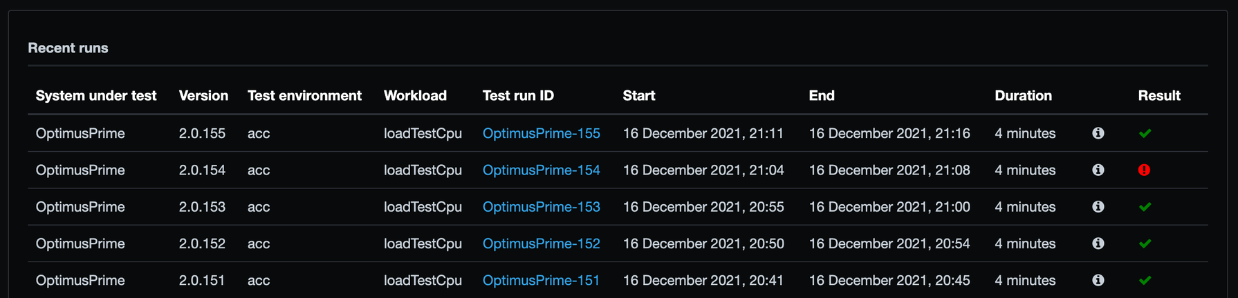
We see from the bottom to the top the automatic runs of the continuous performance tests. Run 151 to 153 are all green. But run 154 shows a red exclamation mark. What happened? Let’s have a look at the results of run 154:
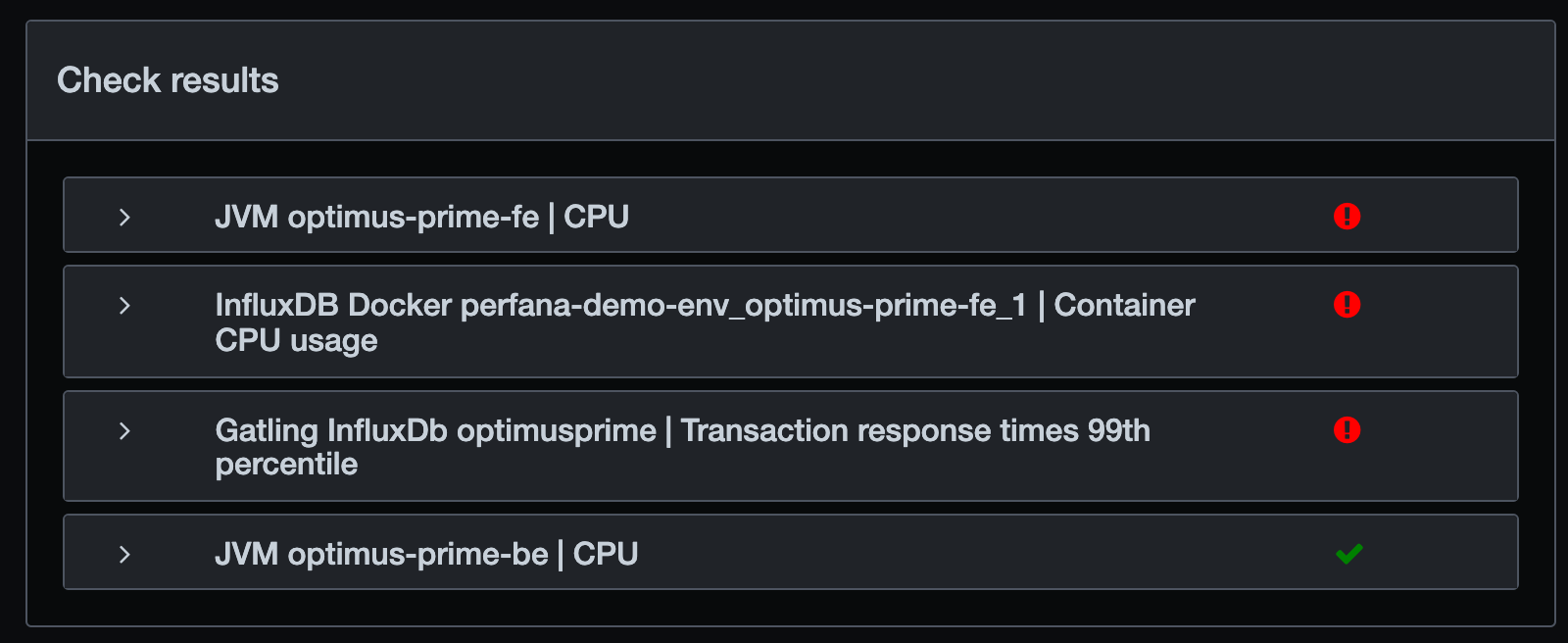
The (99th percentile) response times do not meet the requirements and and the CPU usage of the fronted (fe) service has an issue. High CPU usage can cause high response times, so we look at the CPU check result details:
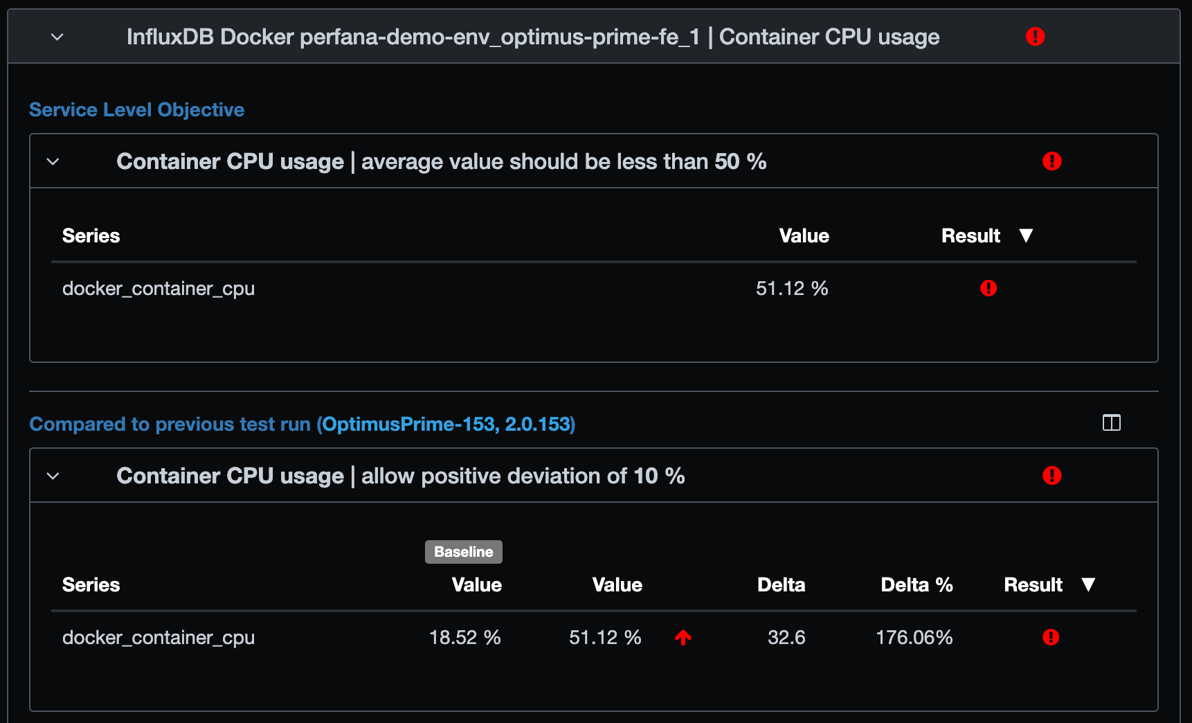
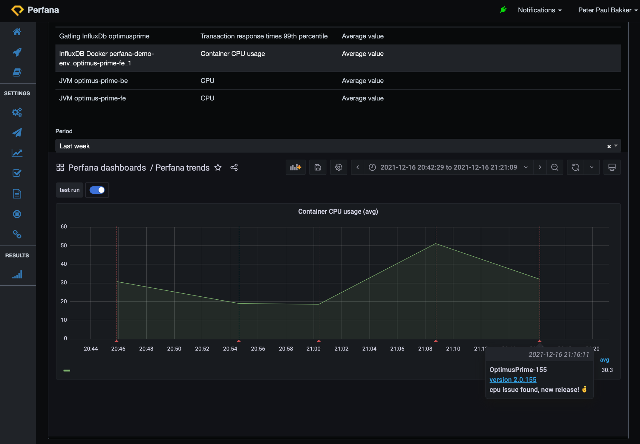
There is 51.12% average CPU usage during the test, and the requirement is that the average CPU usage must be less than 50%. The average CPU usage has more than doubled from the previous run 153. That exceeds another requirement: a new run should not have more than 10% growth compared to the pervious run, for container CPU usage. It is actually an increase of a whopping 176%, so another red exclamation mark! We cannot go into production with this release that causes high CPU. We need to investigate and find the root cause.
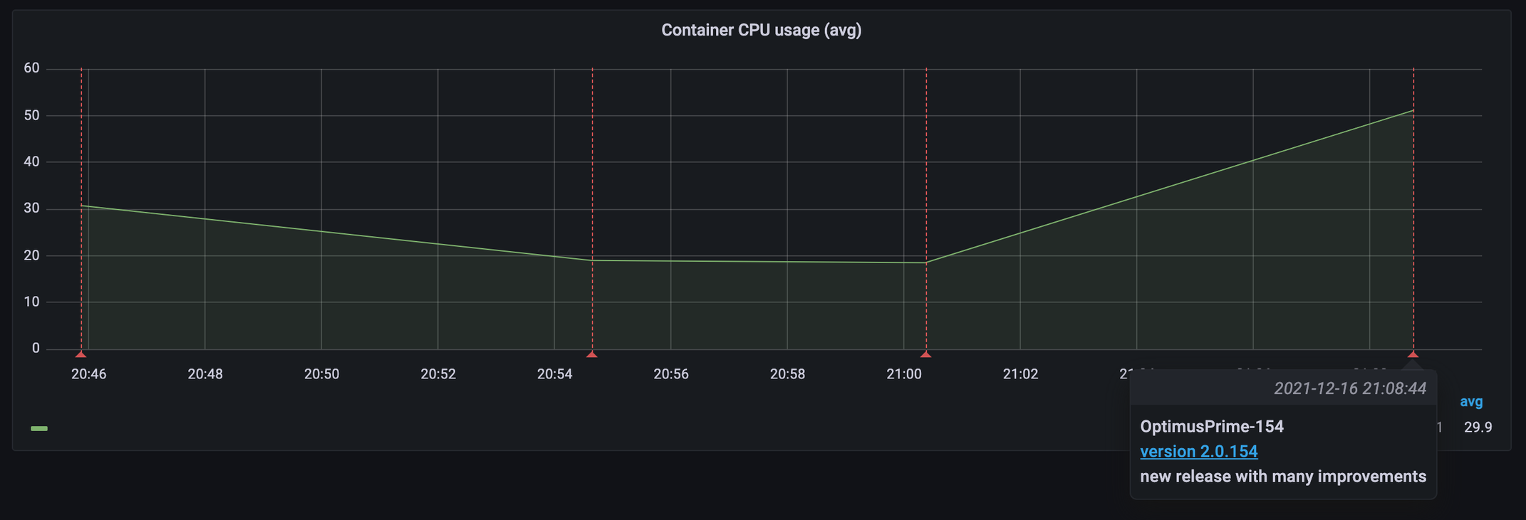
In the trend view we notice the increase of CPU for the last run. Each red vertical line is a test run. Hovering over the line shows the run information.
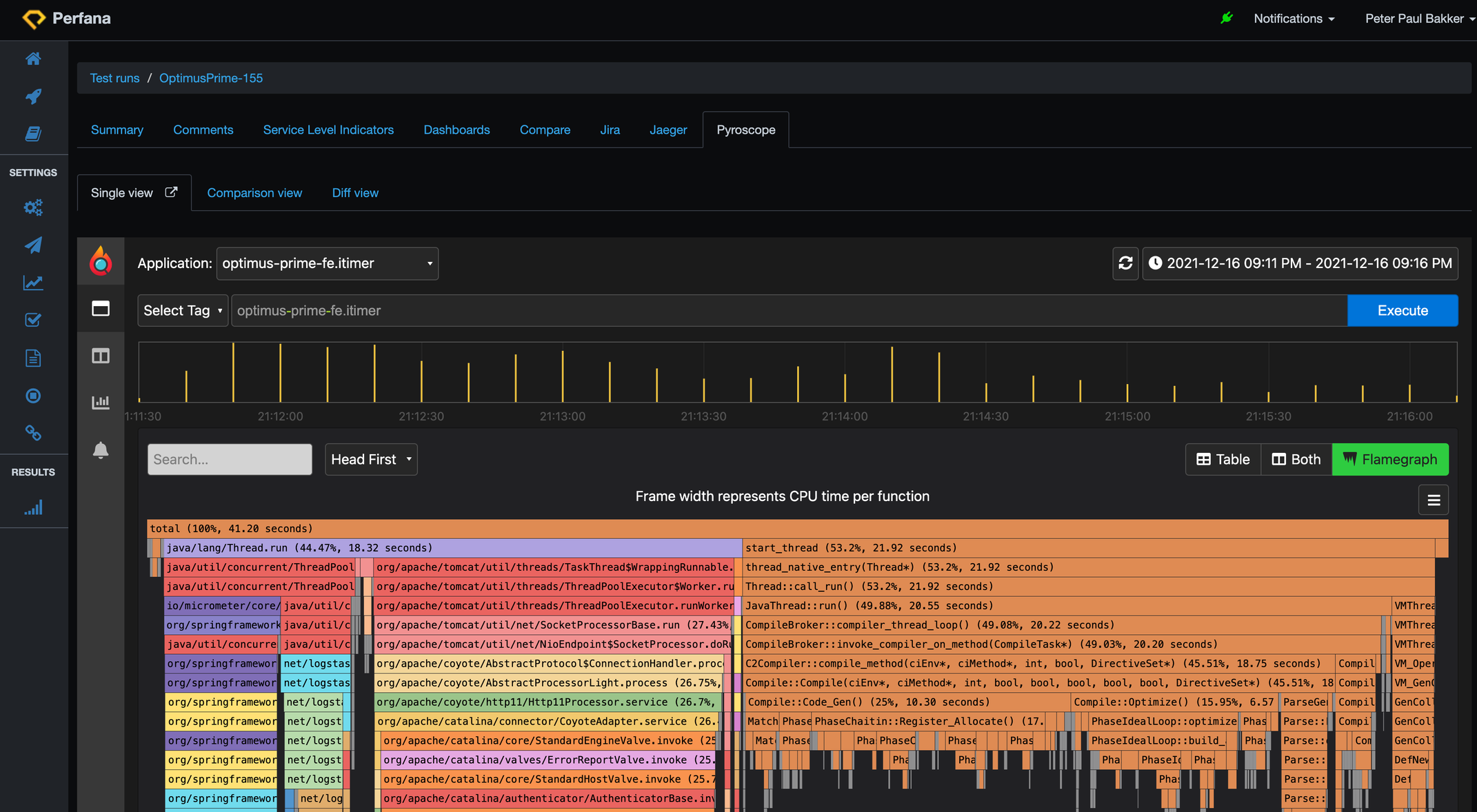
 Can we lower the CPU load with a fix? CPU flame graphs are a great way to find CPU hotspots. We have activated Pyroscope (continuous CPU profiling) on our service, so we can easily investigate the flame graph for a particular test run. The Perfana Pyroscope tab brings you right to the flame graph of a particular run. Here is the flame graph for run 154:
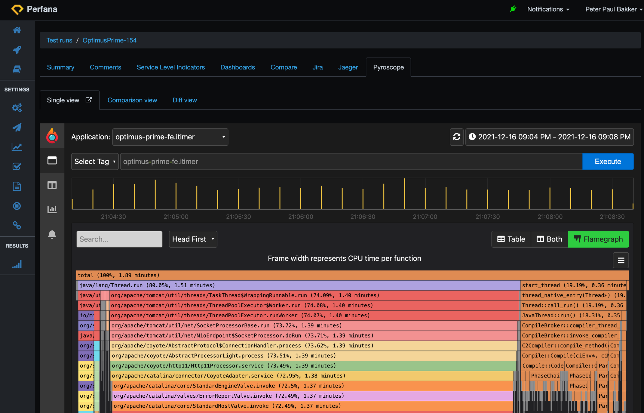 The colourful bars are from our spring boot application running an embedded Tomcat application server. The brownish flame on the right are native java threads on CPU. You can see the C3 compiler CPU usage. We can zoom to the lower parts of the flame graph. Wide bars at the lowest level means the method is running on the CPU. The longer the bar, the more CPU (time) is used:
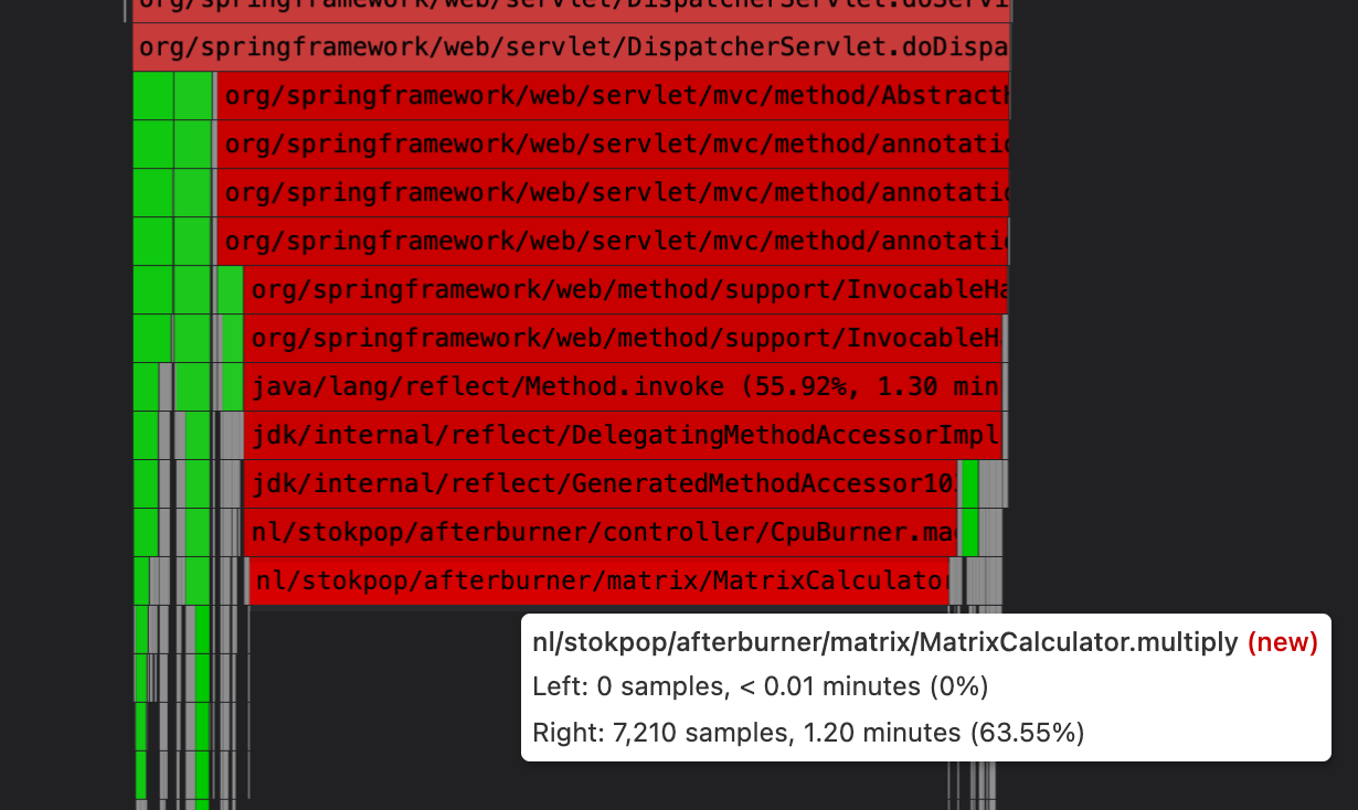
And we can also compare with the previous run 153 by going to the diff view:

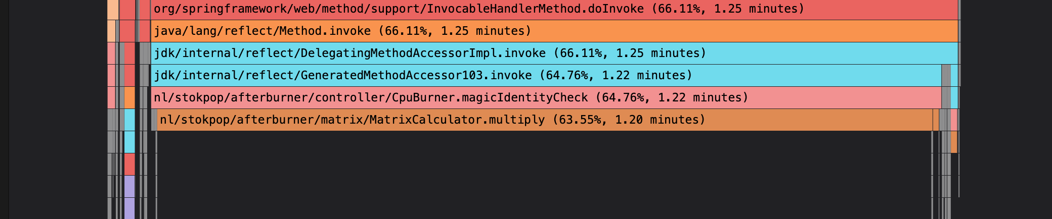
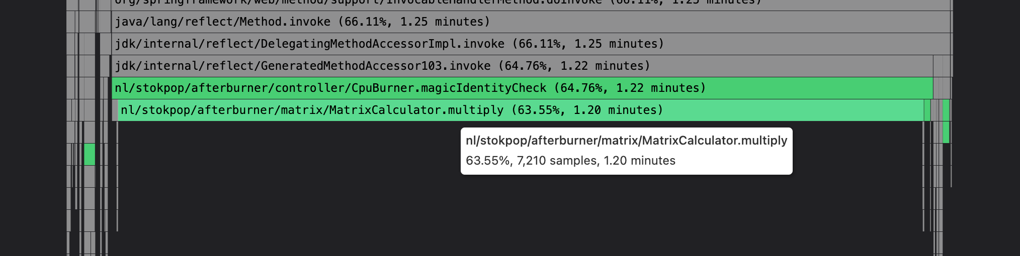
Notice that indeed the MatrixCalculator.multiply() method is a big difference between the runs:
Next step is to investigate the code of the multiply() method. Why does it use all of this CPU? Why is this different from previous runs, what changed?
We sit down with the developers. There is indeed a change in this code since last release and found a way to make it more efficient. The new code short-wires certain calculations and in the process also reduces memory allocations.
Now we happily deploy the new version, with the more efficient calculation activated. We choose to do so with a feature toggle so we can test it with:featureToggleIdentityMatrix=true. We kick off a new test run 155 and check the compare results to the previous run 154 via the compare tab:
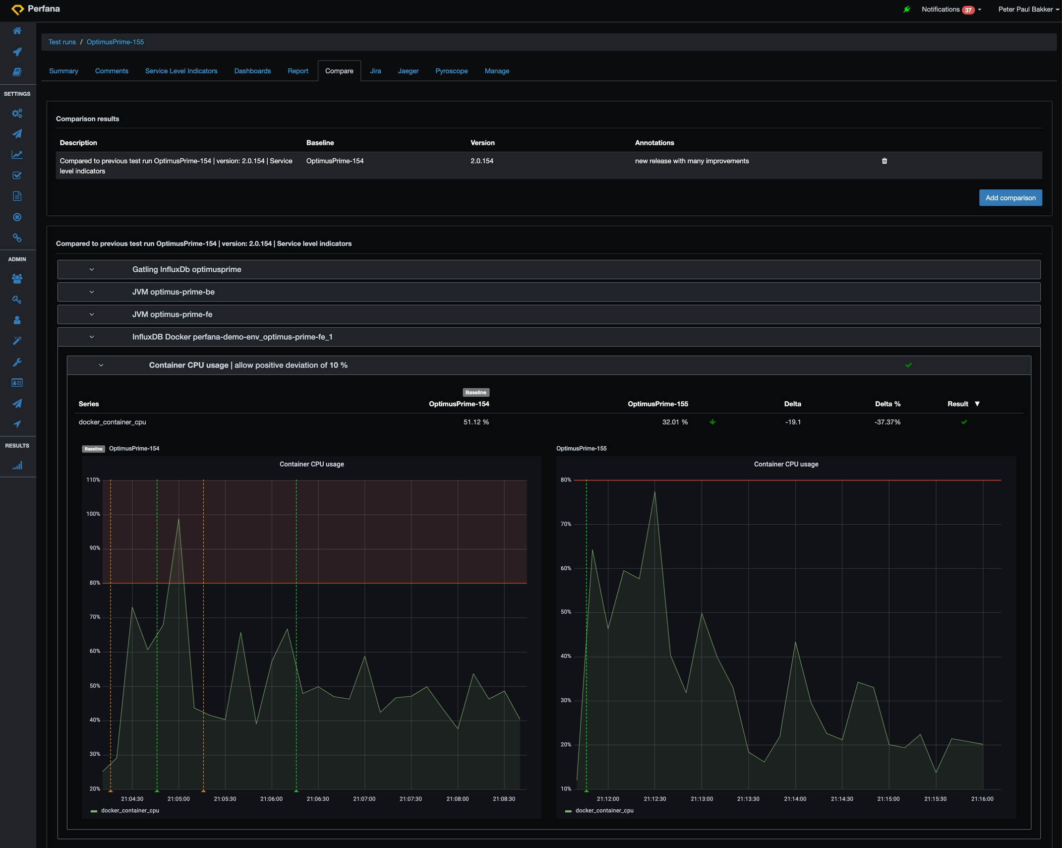
Look! Less CPU usage. It dropped from around 51% to 32% CPU usage, an improvement of almost 40%. …and better response times! From 65 ms per calculation to 15 ms. An improvement of 76%. Happy users and happy “whoever pays the cloud compute bills”.
If we look a bit deeper, we see that the flame graph looks different now:
 It looks like the java native threads are doing a lot more (the brown flames), but that is relative to the application CPU usage (the colourful flames). So that is already an indication that the application CPU is lower now. At the top bar there is 41.20 seconds of CPU time, in the previous run that was 1.89 minutes: much lower CPU time in total.
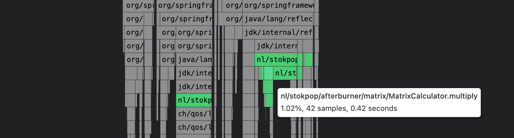
And we can also see the difference in the flame graph using the comparison view, and searching for “multiply” method which highlights in green. At the top the flame graph of run 154: method appears in 7.210 samples with 1.20 minutes CPU time, and below the fixed run 155: method appears in 42 samples with 0.42 seconds CPU time: (notice that the sampling rate of Pyroscope is set to 0.1 second, so 42 samples is calculated into 0.42 seconds).
 Perfana trends shows that we are back on track for our CPU usage for run 155:
 In part 2 of the blog we will look into the flame graph in more detail. Can we find other hotspots to solve?
Recap: Perfana lets teams track and verify their application performance on every build. It warns you when the performance is not up-to-par and helps you find the root cause. After a fix and re-run, you can easily see if the fix has positive impact at a high level (CPU, response times) and lower level (CPU flame graphs). Flame graphs are a great tool to find CPU hotspots and you can continuously generate them.